Page 37 - DCAP101_BASIC_COMPUTER_SKILLS
P. 37
Basic Computer Skills


                        Notes


                                                     Graphical Representation of Data


                                               nce we have data organized in tabular form we can represent it as a graph. We
                                               are going to build a basic histogram (also called, for the time being, a bar graph
                                        Oor frequency distribution graph) using Excel Chart Wizard. Again, there are
                                        numerous approaches to building and modifying graphs; the method shown below is just
                                        one, and not necessarily the most correct, easiest, or clearest for everyone.
                                        Mechanics of constructing a basic histogram

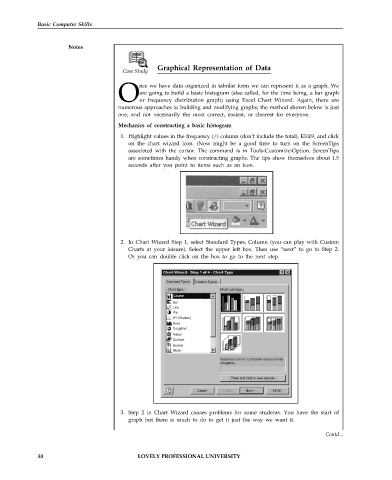
                                         1. Highlight values in the frequency (/) column (don’t include the total), E3:E9, and click
                                           on the chart wizard icon. (Now might be a good time to turn on the ScreenTips
                                           associated with the cursor. The command is in Tools-Customize-Option. ScreenTips
                                           are sometimes handy when constructing graphs. The tips show themselves about 1.5
                                           seconds after you point to items such as an icon.


                                         2. In Chart Wizard Step 1, select Standard Types, Column (you can play with Custom
                                           Charts at your leisure). Select the upper left box. Then use “next” to go to Step 2.
                                           Or you can double click on the box to go to the next step.


                                                        Standard Types  Custom Types
                                                                               t
                                                         Chart type:      Chart sub- ype:
                                                          Bar
                                                          Line
                                                          Pie
                                                          XY (Scatter)
                                                          Area
                                                          Doughnut
                                                          Radar
                                                          Surface
                                                          Bubble
                                                          Stock


                                         3. Step 2 in Chart Wizard causes problems for some students. You have the start of
                                           graph but there is much to do to get it just the way we want it.

                                                                                                             Contd...


             30                                LOVELY PROFESSIONAL UNIVERSITY

