Page 79 - DCOM203_DMGT204_QUANTITATIVE_TECHNIQUES_I
P. 79
Quantitative Techniques – I


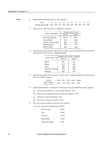
                    Notes          8.  Represent the following data by a line diagram:
                                               S No.     :  1    2    3   4    5    6   7    8    9   10
                                                .
                                         Weekly Income ( ) : 240 270 315 318 330 345 354 360 375 390
                                   9.  Represent the following data by multiple bar diagram:


                                                                          2009-10     2010-11


                                   10.  The following table gives the support price of Rabi-crops during 2009-2010 and 2010-2011.
                                       Represent the given data by a suitable diagram.


                                                                       2009-10      2010-11


                                   11.  The following table shows the yield of wheat in five countries during 2010. Represent the
                                       data by a suitable diagram.
                                                      Country   : China EEC USA India Canada
                                                     Yield of Wheat  :  3194  5118 2656 2125  2272
                                                   (in Kg./ hect.)

                                   12.  Represent the increase or decrease of production of the year 2010 through bar diagram:
                                       (a)  Increase in production of cotton textile industry = 60%
                                       (b)  Increase in the production of iron and steel industry = 50%
                                       (c)  Decrease in sugar production = 40%

                                       (d)  Decrease in cement production = 30%
                                   13.  Show the following data by means of a pie diagram:
                                       Area-wise exports from India during 2010-11.
                                                 West Europe   :       31.38%

                                                 Asia          :       31.04%
                                                 America       :       16.49%
                                                 East Europe   :       18.24%
                                                 Africa and others :    2.85%


          74                                LOVELY PROFESSIONAL UNIVERSITY

