Page 105 - DCAP208_Management Support Systems
P. 105
Management Support Systems


                    Notes
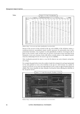
                                                             Figure 7.1: Data Visualization


                                   Source: http://www.sas.com/data-visualization/overview.html
                                   Because of the amount of data collected on the age and reliability of the cell phone motors, a
                                   traditional electronic spreadsheet cannot visually represent the information due to data
                                   presentation limitations. And, if printed out, the spreadsheets would be a humongous pile of
                                   paper on the director’s desk. In both cases, the director would spend hours searching among
                                   thousands of rows and columns of data with still no concrete answer to the original question
                                   about the relationship between the motor’s age and its reliability.
                                   Data visualization presents the data in a way that the director can easily interpret, saving time
                                   and energy.
                                   For example, the graph below shows the number of units that correspond to each age (represented
                                   by the color gradient) as well as the reliability as the age of a unit increases. In a matter of
                                   seconds, the director can see that units approaching 10 years of age are approximately 40 percent
                                   reliable. This visual simplifies the data, instantly clarifying the factors affecting the reliability of
                                   the cell phone motors.
                                                      Figure 7.2: Graph Showing the  Number of  Units


                                   Source: http://www.sas.com/data-visualization/overview.html


          98                                LOVELY PROFESSIONAL UNIVERSITY

