Page 22 - DCAP303_MULTIMEDIA_SYSTEMS
P. 22
Multimedia Systems


                   notes         The saying “A picture is worth a thousand words” (and perhaps more when audio, video and
                                 animation are added) is as true in multimedia as on the printed page.
                                 Although  there  are  certain  titles  where  text  predominates,  such  as  reference  works  like
                                 encyclopaedias, combining other elements with text can often reduce the amount of text needed
                                 to convey a concept.
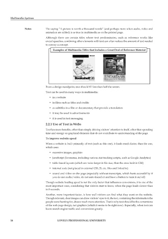
                                       examples of Multimedia titles that includes a Great Deal of reference Material


                                 From a design standpoint, text should fill less than half the screen.
                                 Text can be used in many ways in multimedia:
                                    •  in a website
                                    •  in films such as titles and credits

                                    •  as subtitles in a film or documentary that provide a translation
                                    •  it may be used in advertisements
                                    •  it is used in text messaging.

                                 2.2.1 Use of text in Webs
                                 Text has more benefits, other than simply driving visitors’ attention to itself, other than spending
                                 time and energy on graphical elements that do not contribute to understanding of the page.
                                 to improve website speed
                                 When a website is built primarily of text (such as this one), it loads much faster, than the one,
                                 which uses:
                                    •  excessive images, graphics

                                    •  JavaScript (for menus, including various stat tracking scripts, such as Google Analytics)
                                    •  table-based layouts (which are twice larger in file size, than the ones built in CSS)
                                    •  internal code (not placed in external CSS, JS, etc. files and linked to)

                                    •  sound and video on the page (especially without transcripts, which hurts accessibility if
                                      you do use audio/video, do not auto-launch it and have a button to turn it on/off)

                                 Though website loading speed is not the only factor that influences conversions, it is one of the
                                 most important ones, considering that visitors start to leave, when the page loads slower than
                                 in 8 seconds.
                                 Another, more important factor, is how well visitors can find what they want on the website.
                                 Though relevant, clear images can draw visitors’ eyes to it, the text, containing the information the
                                 people were hunting for, draws much more attention. That is why text should be the cornerstone
                                 of the web page design, not graphics (which it seems to be right now). Especially, when text can
                                 boost search engine traffic and conversions greatly.


        16                                LoveLy professionaL University

