Page 245 - DCAP303_MULTIMEDIA_SYSTEMS
P. 245
Unit 14: Designing for World Wide Web (WWW)


            Notice the more you compress a JPEG image, the more artifacts you begin to see. This is because   notes
            you are actually loosing information. The JPEG compression is therefore called lossy compression.
            You may also notice that the colour fidelity does not change. Colours are not lost in JPEG images.
            When you use JPEG compression you will trade off between image quality and image file size.
            In the example above, the Medium Quality image is acceptable and is 2 KB smaller than the high
            quality example.
            Note: If you had tried to use GIF compression on the rose, the file size would be over 15 KB.


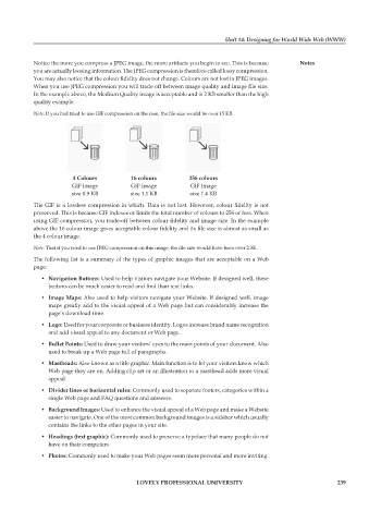
                         4 Colours         16 colours         256 colours
                        GIF Image          GIF Image          GIF Image
                        size 0.9 KB        size 1.1 KB        size 1.4 KB
            The GIF is a lossless compression in which. Data is not lost. However, colour fidelity is not
            preserved. This is because GIF indexes or limits the total number of colours to 256 or less. When
            using GIF compression, you trade-off between colour fidelity and image size. In the example
            above the 16 colour image gives acceptable colour fidelity and its file size is almost as small as
            the 4 colour image.
            Note: That if you tried to use JPEG compression on this image, the file size would have been over 2.3K.
            The following list is a summary of the types of graphic images that are acceptable on a Web
            page:
               •  navigation Buttons: Used to help visitors navigate your Website. If designed well, these
                 buttons can be much easier to read and find than text links.
               •  image Maps: Also used to help visitors navigate your Website. If designed well, image
                 maps greatly add to the visual appeal of a Web page but can considerably increase the
                 page’s download time.
               •  Logo: Used for your corporate or business identity. Logos increase brand name recognition
                 and add visual appeal to any document or Web page.
               •  Bullet points: Used to draw your visitors’ eyes to the main points of your document. Also
                 used to break up a Web page full of paragraphs.
               •  Mastheads: Also known as a title graphic. Main function is to let your visitors know which
                 Web page they are on. Adding clip art or an illustration to a masthead adds more visual
                 appeal.

               •  Divider lines or horizontal rules: Commonly used to separate footers, categories within a
                 single Web page and FAQ questions and answers.

               •  Background images: Used to enhance the visual appeal of a Web page and make a Website
                 easier to navigate. One of the most common background images is a sidebar which usually
                 contains the links to the other pages in your site.
               •  Headings (text graphic): Commonly used to preserve a typeface that many people do not
                 have on their computers.
               •  photos: Commonly used to make your Web pages seem more personal and more inviting.


                                             LoveLy professionaL University                                   239

