Page 203 - DMGT209_QUANTITATIVE_TECHNIQUES_II
P. 203
Quantitative Techniques-II


                      Notes            2.  The two variables may act upon each other: Cause and effect relation exists in this
                                           case also but it may be very difficult to find out which of the two variables is
                                           independent. For example, if we have data on price of wheat and its cost of production,
                                           the correlation between them may be very high because higher price of wheat may
                                           attract farmers to produce more wheat and more production of wheat may mean
                                           higher cost of production, assuming that it is an increasing cost industry. Further,
                                           the higher cost of production may in turn raise the price of wheat. For the purpose
                                           of determining a relationship between the two variables in such situations, we can
                                           take any one of them as independent variable.

                                       3.  The two variables may be acted upon by the outside influences: In this case we might
                                           get a high value of correlation between the two variables, however, apparently no
                                           cause and effect type relation seems to exist between them. For example, the demands
                                           of the two commodities, say X and Y, may be positively correlated because the
                                           incomes of the consumers are rising. Coefficient of correlation obtained in such a
                                           situation is called a spurious or nonsense correlation.
                                       4.  A high value of the correlation coefficient may be obtained due to sheer coincidence
                                           (or pure chance): This is another situation of spurious correlation. Given the data on
                                           any two variables, one may obtain a high value of correlation coefficient when in
                                           fact they do not have any relationship. For example, a high value of correlation
                                           coefficient may be obtained between the size of shoe and the income of persons of a
                                           locality.

                                    10.1.1 Scatter Diagram

                                    Let the bivariate data be denoted by (X , Y ), where i = 1, 2 ...... n. In order to have some idea about
                                                                   i  i
                                    the extent of association between variables X and Y, each pair (X , Y ), i = 1, 2......n, is plotted on
                                                                                        i  i
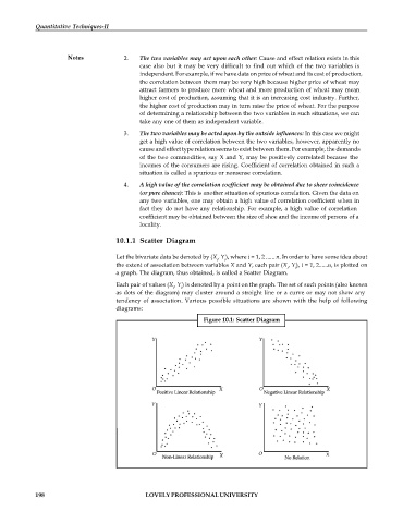
                                    a graph. The diagram, thus obtained, is called a Scatter Diagram.
                                    Each pair of values (X , Y ) is denoted by a point on the graph. The set of such points (also known
                                                      i  i
                                    as dots of the diagram) may cluster around a straight line or a curve or may not show any
                                    tendency of association. Various possible situations are shown with the help of following
                                    diagrams:
                                                               Figure 10.1: Scatter Diagram


            198                              LOVELY PROFESSIONAL UNIVERSITY

