Page 60 - DMGT552_VISUAL_MERCHANDISING
P. 60
Unit 3: Image Mix


                                                                                                Notes
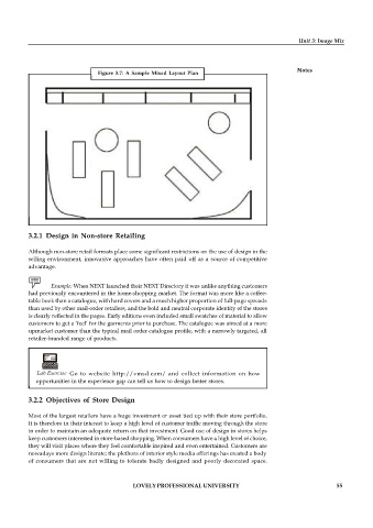
                                Figure  3.7:  A  Sample  Mixed  Layout  Plan


          3.2.1 Design in Non-store Retailing


          Although non-store retail formats place some significant restrictions on the use of design in the
          selling environment, innovative approaches  have often paid off  as a source of  competitive
          advantage.

                 Example: When NEXT launched their NEXT Directory it was unlike anything customers
          had previously encountered in the home-shopping market. The format was more like a coffee-
          table book than a catalogue, with hard covers and a much higher proportion of full-page spreads
          than used by other mail-order retailers, and the bold and neutral corporate identity of the stores
          is clearly reflected in the pages. Early editions even included small swatches of material to allow
          customers to get a ‘feel’ for the garments prior to purchase. The catalogue was aimed at a more
          upmarket customer than the typical mail order catalogue profile, with a narrowly targeted, all
          retailer-branded range of products.


             Lab Exercise   Go  to  website  http://vmsd.com/  and  collect  information  on  how
             opportunities in the experience gap can tell us how to design better stores.

          3.2.2 Objectives of Store Design

          Most of the largest retailers have a huge investment or asset tied up with their store portfolio.
          It is therefore in their interest to keep a high level of customer traffic moving through the store
          in order to maintain an adequate return on that investment. Good use of design in stores helps
          keep customers interested in store-based shopping. When consumers have a high level of choice,
          they will visit places where they feel comfortable inspired and even entertained. Customers are
          nowadays more design literate; the plethora of interior style media offerings has created a body
          of  consumers that are not  willing to tolerate badly  designed and poorly  decorated  space.


                                           LOVELY PROFESSIONAL UNIVERSITY                                   55

