Page 85 - DMGT206_PRODUCTION_AND_OPERATIONS_MANAGEMENT
P. 85
Production and Operations Management
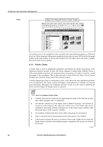
Notes Figure 4.11: Using MS Excel to Create Graphs
The easiest way to create a graph is to enter your data into a spreadsheet program; e.g., Microsoft
Excel, etc. These programs will generate graphs from the data you enter. MS Excel has the graph
toolbar on the main toolbar, as can be seen in Figure 4.11. The figure shows the types of graphs
that can be done Excel programs.
4.3.3 Pareto Charts
A Pareto chart is used to graphically summarize and display the relative importance of the
differences between groups of data. The Pareto diagram is named after Vilfredo Pareto, a
19th-century Italian economist who postulated that a large share of wealth is owned by a small
percentage of the population. This is often referred to as the 80-20 rule; that is, 80 per cent of
problems are caused by 20 per cent of the potential sources.
A Pareto diagram puts data in a hierarchical order, which allows the most significant problems
to be corrected first. The Pareto analysis technique is used primarily to identify and evaluate
non-conformities, although it can summarize all types of data. It is also used to analyzing the
before and after impact of changes made in a process.
Notes How to Construct Pareto Chart
A Pareto chart can be constructed by segmenting the range of the data into groups
(also called segments, bins or categories).
The left-side vertical axis of the Pareto chart is labeled ‘frequency’ (the number of
counts for each category), the right-side vertical axis of the Pareto chart is the
cumulative percentage, and the horizontal axis of the Pareto chart is labeled with
the group names of the response variables.
The numbers of data points that reside within each group are determined.
Select a standard unit of measurement and the time period to be studied.
Collect and summarize the data to construct a Pareto chart. Unlike the bar chart, the
Pareto chart is ordered in descending frequency magnitude. The groups are defined
by the user.
Contd...
80 LOVELY PROFESSIONAL UNIVERSITY

