Page 82 - DMGT206_PRODUCTION_AND_OPERATIONS_MANAGEMENT
P. 82
Unit 4: Quality Control
Notes
Example: The pupils in a class were asked how they got to school. The frequency is how
often a particular response occurred. We can see that the frequency of ‘walk’ is 9, so there must
have been 9 pupils who said that they walked to school. Information can be counted or grouped
into convenient categories or a range, e.g., height of plants in cm. 1 to 5 cm. 6 to 10 cm., etc. The
characteristics may be measurable on a continuous scale e.g., diameter, time, or length; or on a
yes-or-no basis (go-no-go); e.g. diameter, time, or length.
Table 4.3: Tally Chart
4.3.2 Histograms and Graphs
Information from the checklist of tally chart is used to construct histograms or bar charts. These
are basic forms that help standardize data collection.
A histogram summarizes data measured on a continuous scale, showing the frequency
distribution of some quality characteristic (in statistical terms, the central tendency and dispersion
of the data). Often the mean of the data is indicated on the histogram.
Graphs are perhaps the most widely used but least talked about tools in business. Graphs are
convenient ways to clearly show your data. They represent data in a variety of formats. The
selection of a graph should be on the basis of the kind and purpose of data that needs to be
presented. There are three basic graph forms and their variations: the bar graph, the line graph,
and the pie graph.
Bar Graph
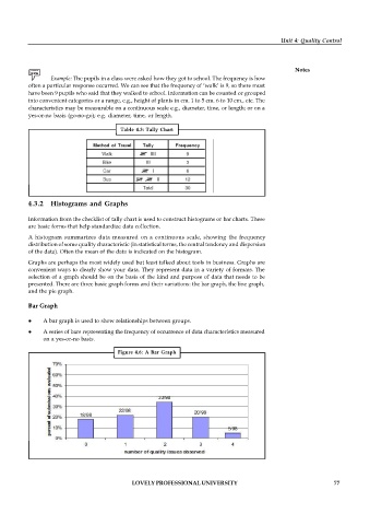
A bar graph is used to show relationships between groups.
A series of bars representing the frequency of occurrence of data characteristics measured
on a yes-or-no basis.
Figure 4.6: A Bar Graph
LOVELY PROFESSIONAL UNIVERSITY 77

