Page 253 - DCAP303_MULTIMEDIA_SYSTEMS
P. 253
Unit 14: Designing for World Wide Web (WWW)


             samataMason.com                                                                      notes


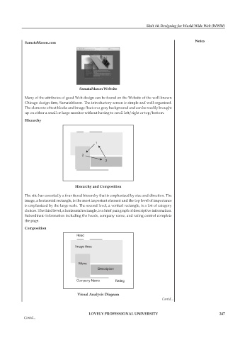
                                        samataMason Website
             Many of the attributes of good Web design can be found on the Website of the well-known
             Chicago design firm, SamataMason. The introductory screen is simple and well organized.
             The elements of text blocks and image float on a gray background and can be readily brought
             up on either a small or large monitor without having to scroll left/right or top/bottom.
             Hierarchy


                                      Hierarchy and Composition

             The site has essentially a four tiered hierarchy that is emphasized by size and direction. The
             image, a horizontal rectangle, is the most important element and the top level of importance
             is emphasized by the large scale. The second level, a vertical rectangle, is a list of category
             choices. The third level, a horizontal rectangle, is a brief paragraph of descriptive information.
             Subordinate information including the heads, company name, and rating control complete
             the page.
             Composition


                                       visual analysis Diagram
                                                                                 Contd...


                                             LoveLy professionaL University                                   247
             Contd...

