Page 255 - DCAP303_MULTIMEDIA_SYSTEMS
P. 255
Unit 14: Designing for World Wide Web (WWW)


             The page rating invitation gives the viewer an opportunity to provide direct feedback to   notes
             SamataMason about the effectiveness of their Web presence. The viewer can quickly rate
             the page and if desired can click the “comments” category, which opens another window, to
             provide written feedback and rate the page as to content, design, usability, and overall. Clearly,
             the firm cares about the Web usability of the site and is interested in the opinion of the user.

             Subsequent Web pages become only slightly more complex with the addition of another block
             of text to the right of the description. This block lists series choices within the category and
             serves to show the firm’s range of capabilities. The viewer is readily engaged in the information
             because the choices are so clear that he/she knows immediately how to access information.
             There is no time lost figuring out how to navigate or return to a previous selection.
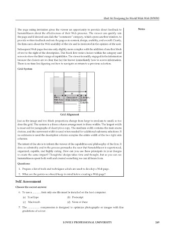
             Grid system


                                           Grid alignment

             Just as the image and text block proportions change from large to medium to small, so too
             does the grid. The system is a three column arrangement in three widths. The largest width
             is reserved for paragraphs of descriptive copy. The medium width contains the main menu
             choices, and the narrowest width is used when needed for additional submenu selections. If
             no submenu is used the description column occupies the entire width of the two right side
             columns.
             The intent of the site is to inform the viewer of the capabilities and philosophy of the firm. It
             does so admirably and in the process persuades the user that SamataMason is experienced,
             organized, capable, and highly caring. How can you use these principals in your designs
             to create the same impact? Thoughtful design takes time and thought, but as you can see
             SamataMason spent both well and created something we can all learn from.

             Questions:
              1.  Prepare a list of tools and techniques which are used to develop a Web page.
               2.  What are the points we should keep in mind before creating a Web page?

            self assessment

            Choose the correct answer:
               6.  To use a ............. font only one file must be installed on the host computer.
                 (  a)  TrueType                (b)  Postscript
                 (  c)   Macintosh              (d)  None of these

               7.  The .................. compression is designed to optimize photographs or images with fine
                 gradations of colour.


                                             LoveLy professionaL University                                   249

