Page 254 - DCAP303_MULTIMEDIA_SYSTEMS
P. 254
Multimedia Systems


                   notes           The scale of the major visual elements of image and text blocks is pleasing. The text blocks of
                                   the heads, menu and company name align and give a sense of order. The menu block overlaps
                                   the image on a transparent field that literally overlaps and attaches itself to the image and
                                   provides unity. The eye moves fluidly from the image to the menu to the description that
                                   is tucked in the negative space. This triangular movement feels comfortable, keeps the user
                                   focused on the centre of the page, and enhances the cohesive feel of the page.
                                   Brevity
                                   The simplicity of design makes the Website inviting from the start. Although there is a lot of
                                   information the user is met with an engaging organizational structure. Choices are clear and
                                   to the point, and the minimal descriptive text is well written. Long blocks of text sometimes
                                   turn-off the viewer because of the length, and are often ignored. Short blocks are much more
                                   enticing and in the case of SamataMason delightful to read.
                                   Cropped images
                                   It is interesting that in all cases the images are not typical studio shots of a complete printed
                                   spread or an object but rather a tightly cropped detail of a larger image. The result is an
                                   intriguing composition that incites curiosity. Because of resolution constraints it is often
                                   difficult to show an entire image effectively. This system allows the viewer to appreciate the
                                   details of the design and get the gist of the project.
                                   visual analysis


                                                             submenu Choices, (right)

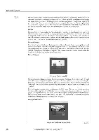
                                   The visual analysis diagram breaks the elements on the Web page down into simple defined
                                   areas. The largest visual element is the image area, shown in light red, as a horizontal rectangle.
                                   This image area is systemized on each Web page and becomes a standard visual element for
                                   each page. This yields a sense of continuity and rhythm to the site even as the information
                                   changes.
                                   Text information occupies four positions on the Web page. The top two blocks are short
                                   headlines. The long vertical text block is a menu with a series of choices that link to other text
                                   pages. The large horizontal text block is a short descriptive paragraph of informative copy.
                                   The company name occupies the bottom text block and aligns with a plus sign in brackets
                                   that when clicked invites the viewer to “rate the page.”
                                   rating and feedback


                                                         rating and feedback, (lower right)
                                                                                                      Contd...


        248                               LoveLy professionaL University

