Page 88 - DCAP512_WAP_AND_WML
P. 88
WAP & WML


                    Notes          careful consideration and planning should go into any WAP application; don’t start coding
                                   without investing time in planning.


                                     Notes  Remember your audience. Mobile users generally scroll through cards rapidly and
                                     will be reading on a display that’s a mere handful of characters wide (usually less than 20
                                     characters) and usually less than 10 lines high. Keep your content to a minimum, provide
                                     an intuitive navigation structure, and optimize your decks to maximize links within the
                                     deck and minimize links outside of the deck.
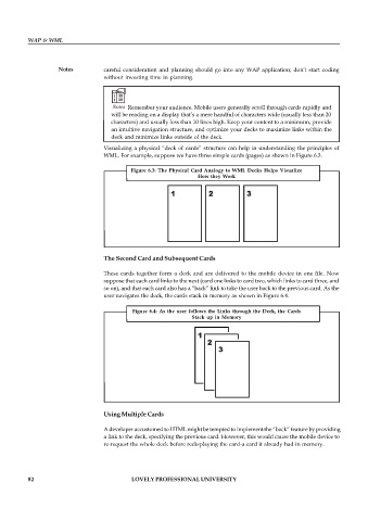
                                   Visualizing a physical “deck of cards” structure can help in understanding the principles of
                                   WML. For example, suppose we have three simple cards (pages) as shown in Figure 6.3.

                                           Figure 6.3:  The Physical  Card Analogy  to WML  Decks Helps  Visualize
                                                                 How they Work


                                   The Second Card and Subsequent Cards

                                   These cards  together form  a deck  and are  delivered to  the mobile  device in  one file.  Now
                                   suppose that each card links to the next (card one links to card two, which links to card three, and
                                   so on), and that each card also has a “back” link to take the user back to the previous card. As the
                                   user navigates the deck, the cards stack in memory as shown in Figure 6.4.

                                            Figure 6.4:  As the  user follows the Links  through the Deck, the  Cards
                                                               Stack  up  in  Memory


                                   Using Multiple Cards

                                   A developer accustomed to HTML might be tempted to implement the “back” feature by providing
                                   a link to the deck, specifying the previous card. However, this would cause the mobile device to
                                   re-request the whole deck before redisplaying the card-a card it already had in memory.


          82                                LOVELY PROFESSIONAL UNIVERSITY

