Page 289 - DMGT206_PRODUCTION_AND_OPERATIONS_MANAGEMENT
P. 289
Production and Operations Management


                    Notes          completion date. A visual tool, the charts allow us to obtain a bird’s eye view of the process in
                                   its totality. From beginning to end the charts force us to:
                                   1.  Make a realistic assessment of the end-time of the process.

                                   2.  Sequence our tasks (or phases, or activities)—one after the other, as well as in parallel.
                                   3.  Think in terms of task dependencies—which task is dependent on what.
                                   4.  Concentrate on the necessary resources, both when and where, throughout the run of the
                                       process.

                                   There are many ways to create a Gantt chart.

                                          Example: Microsoft Project, a task-planning program, makes it easy to track and chart
                                   project timeliness with a built-in Gantt chart view. Another option is to use Excel. Excel does not
                                   contain a built-in Gantt chart format, however, you can create a Gantt chart in Excel by customizing
                                   the stacked bar chart type.
                                   The procedure for making a Gantt chart using MS Excel is given below.
                                   Step 1: The first step is to enter the sample data
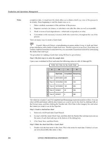
                                   Open a new worksheet in Excel and enter the following values in cells A1 through D6:

                                                           Table 14.2:  Data for  the Gantt  Chart

                                                           A       B         C         D

                                                      1        Start Date   Completed  Remaining

                                                      2  Task 1  08/01/2000  205   10

                                                      3  Task 2  10/15/2000  200   120

                                                      4  Task 3  12/15/2000  140   200

                                                      5  Task 4  02/06/01   44     345

                                                      6  Task 5  05/06/01   0      380


                                   The values in columns C and D (Completed and Remaining) represent numbers of days. You can
                                   select cell B2 and format with the date format you want to use for the chart by clicking Cells on
                                   the Format menu, and then clicking the Number tab. Click Date in the Category list, and select
                                   the format you want to use in the Type list.
                                   Step 2: Create a stacked bar chart

                                   1.  Select cells A1:D6 and click Chart Wizard.
                                   2.  In step 1, click Bar under Chart Type, and then click the Stacked Bar sub-type (you can see
                                       the name of each chart sub-type at the bottom of the dialog box).

                                   3.  Click Next, Next, and then Finish.
                                   Step 3: Make the chart look like a Gantt chart
                                   1.  Double-click the first series in the chart. This is the series for start date. If default colours
                                       are set in Excel 2002, this series is blue.


          284                               LOVELY PROFESSIONAL UNIVERSITY

