Page 83 - DMGT206_PRODUCTION_AND_OPERATIONS_MANAGEMENT
P. 83
Production and Operations Management
Notes The bar height indicates the number of times a particular quality characteristic was observed.
The two items being compared do not need to affect each other. It’s a fast way to show big
differences.
Line Graphs
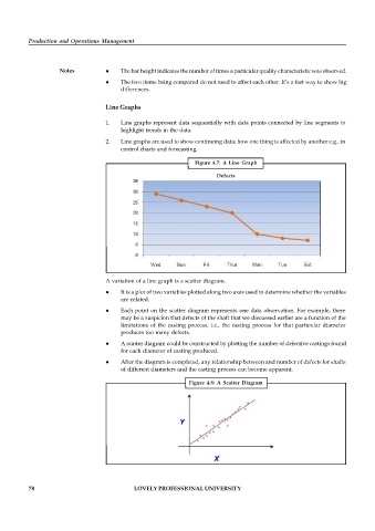
1. Line graphs represent data sequentially with data points connected by line segments to
highlight trends in the data.
2. Line graphs are used to show continuing data; how one thing is affected by another e.g., in
control charts and forecasting.
Figure 4.7: A Line Graph
Defects
A variation of a line graph is a scatter diagram.
It is a plot of two variables plotted along two axes used to determine whether the variables
are related.
Each point on the scatter diagram represents one data observation. For example, there
may be a suspicion that defects of the shaft that we discussed earlier are a function of the
limitations of the casting process, i.e., the casting process for that particular diameter
produces too many defects.
A scatter diagram could be constructed by plotting the number of defective castings found
for each diameter of casting produced.
After the diagram is completed, any relationship between and number of defects for shafts
of different diameters and the casting process can become apparent.
Figure 4.8: A Scatter Diagram
78 LOVELY PROFESSIONAL UNIVERSITY

