Page 79 - DMGT552_VISUAL_MERCHANDISING
P. 79
Visual Merchandising


                    Notes          Self Assessment

                                   Fill in the blanks:
                                   11.  .................................... comprises ceiling, walls, flooring and lighting, but instead of furniture
                                       a retail outlet houses fixtures for the presentation of merchandise, and fittings for equipment
                                       such as tills.
                                   12.  In choosing the materials  used for  the interior, retailers have to consider the type  of
                                       product being sold, costs, store traffic and ....................................

                                   4.4 Elements of Display

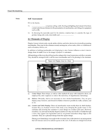
                                   Display fixtures include racks, stands, tables, shelves, and other devices for physically presenting
                                   merchandise. They may be floor fixtures-round, rectangular, or box-racks, cubes –or wall fixtures
                                   such as brackets, shelves, etc.
                                   In addition to holding merchandise and displaying it, store fixtures influence a store’s interior
                                   design, from its traffic flow to the image it projects to customers.
                                   All furnishings of the store should be placed to enhance the visual impression each floor presents.
                                   They should be arranged both to sell the most merchandise and to be pleasing to the customer.

                                                           Figure 4.4:  Display Area  in a  Store


                                   (i)  Corner Shops: These shops, as well as other marked-off areas with distinctive decor, are
                                       employed by store engineers to relieve the monotony of departmental furnishings.

                                   (ii)  Shelves: Obviously, shelves are necessary to store stocked merchandise. They are poor
                                       display areas, however, and should be hidden whenever possible by walls, curtains, and
                                       so on.
                                   (iii)  Counter and Table Display: These sell merchandise more readily than do shelf displays,
                                       because they are located in  front of the stock  areas, bringing the goods nearer to  the
                                       customer and allowing the customer to usual design for counters and cases. However,
                                       rounded, oval, and surrealistically shaped counters not only ease the flow of traffic through
                                       a store, they appear less regimented and do not present hazardous sharp edges to the
                                       customer. They are a pleasant change from the square design.

                                       Placing store furnishings at an angle to the structural lines of the interior is an arrangement
                                       that will increase sales at no added expense to the store. If all aisles are straight from front


          74                                LOVELY PROFESSIONAL UNIVERSITY

