Page 229 - DCAP101_BASIC_COMPUTER_SKILLS
P. 229
Basic Computer Skills


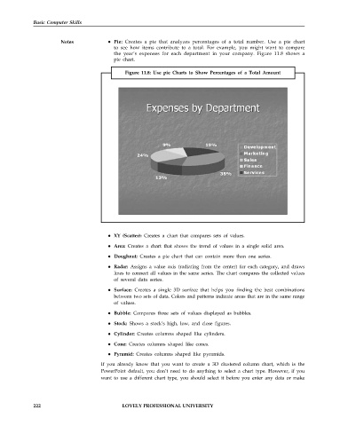
                        Notes              Pie: Creates a pie that analyzes percentages of a total number. Use a pie chart
                                           to see how items contribute to a total. For example, you might want to compare
                                           the year’s expenses for each department in your company. Figure 11.8 shows a
                                           pie chart.

                                                Figure 11.8: Use pie Charts to Show Percentages of a Total Amount


                                           XY (Scatter): Creates a chart that compares sets of values.

                                           Area: Creates a chart that shows the trend of values in a single solid area.
                                           Doughnut: Creates a pie chart that can contain more than one series.

                                           Radar: Assigns a value axis (radiating from the center) for each category, and draws
                                           lines to connect all values in the same series. The chart compares the collected values
                                           of several data series.

                                           Surface: Creates a single 3D surface that helps you finding the best combinations
                                           between two sets of data. Colors and patterns indicate areas that are in the same range
                                           of values.
                                           Bubble: Compares three sets of values displayed as bubbles.

                                           Stock: Shows a stock’s high, low, and close figures.
                                           Cylinder: Creates columns shaped like cylinders.

                                           Cone: Creates columns shaped like cones.
                                           Pyramid: Creates columns shaped like pyramids.
                                       If you already know that you want to create a 3D clustered column chart, which is the
                                       PowerPoint default, you don’t need to do anything to select a chart type. However, if you
                                       want to use a different chart type, you should select it before you enter any data or make


             222                               LOVELY PROFESSIONAL UNIVERSITY

