Page 76 - DMGT206_PRODUCTION_AND_OPERATIONS_MANAGEMENT
P. 76
Unit 4: Quality Control


          The mean for the ranges gives the center line for the R chart. Using standard statistical practice,  Notes
          the Upper Control Limit (UCL) and the Lower Control Limit (LCL), are calculated at 3 times the
          standard deviation. Based on this rationale, the UCL and LCL have been shown in rows 19 and
          20 in Table 4.2.

                                     Table 4.2: The  R Chart  Table


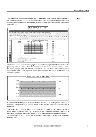
          The data can now be converted into a graphical presentation using the Chart Wizard in Excel. As
          previously in the case of the µ chart, the ‘line type’ chart type is used and values for the 4 series,
          i.e., means of ranges, UCL, CL and LCL incorporated. The y-axis should represent the variable
          measurement and the x-axis represents the sequence of samples. The control chart that results is
          shown as Figure 4.4.

                                   Figure 4.4:  R Chart  for Steel  Shaft


                     0.03
                                                                          UCL

                     0.02


                     0.01
                                                                          CL

                       0

                           1    2   3    4   5    6   7    8    9   10
                     -0.01
                                                                          LCL
                     -0.02

          It can be seen that all the points are within the UCL and the LCL. Since the process variability is
          in  control,  the  process  is  in  control.  These  charts  are  stable  and  can  now  be  used  as
          benchmarks.

          This  means that,  given the  stated  levels,  these  control  limits can  be  adopted  for use  in
          online statistical process control. The X bar chart can now constructed. However, control charts
          require to be updated continuously. Old data should be discarded and replaced by new data.
          This is necessary, in spite of the fact that the data may show that both the R and the X bar chart
          exhibit control.


                                           LOVELY PROFESSIONAL UNIVERSITY                                   71

