Page 68 - DCOM203_DMGT204_QUANTITATIVE_TECHNIQUES_I
P. 68
Unit 4: Presentation of Data


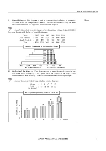
          9.   Pyramid  Diagram:  This diagram is  used to  represent the  distribution of  population  Notes
               according to sex, age, occupation, education, etc. The bars are drawn adjacently one above
               the other so as to look like a pyramid, as shown in the diagram.

                 Example:  Given below are the  figures of enrolment in  a  college during 2005-2010.
          Represent the data with the help of a suitable diagram.
                           Years      : 2005 2006 2007 2008 2009 2010
                       Male Students  :  800   850  1120 1300 1360 1600
                       Female Students :  400  450   480   500   540   600
                           Total      : 1200 1300 1600 1800 1900 2200

                              Sex-wise Distribution  of Students of a  College

                                                 2005
                                                 2006
                                                 2007
                                                 2008
                                                 2009
                                                 2010


          10.  Broken-Scale Bar  Diagram: When  there are  one  or  more  figures  of  unusually  high
               magnitude while the majority of the figures are  of low  magnitude, the  diagrammatic
               representation is done by using a broken scale as shown in the following example.


                 Example: Represent the following data by a suitable diagram :
                                            :
                                            : 10 12 15 80 90
                                (     '000 )

                             Bar Diagram  Representing Profits  of five  Firms


                                           LOVELY PROFESSIONAL UNIVERSITY                                   63

