Page 73 - DCOM203_DMGT204_QUANTITATIVE_TECHNIQUES_I
P. 73
Quantitative Techniques – I


                    Notes          Self Assessment

                                   State whether the following statements are true or false:
                                   9.  One-dimensional diagrams are also known as bar diagrams.
                                   10.  In case of one-dimensional diagrams, the magnitude of the characteristics is shown by the
                                       length or height of the bar.
                                   11.  Sub-divided bar diagram is useful when it is desired to represent the comparative values
                                       of different components of a phenomenon.
                                   12.  Duo-Directional Bar Diagram is used to show an aggregate of two components.
                                   13.  Pyramid Diagram is used to represent the distribution of population according to sex, age,
                                       occupation, education, etc.

                                   4.3 Circular or Pie Diagrams


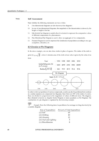
                                   In the above example, one can also draw circles in place of squares. The radius of the circle is
                                                A
                                   given by   r =  , where A denotes area of the circle whose value is given by the value of an
                                   item.
                                                      Year         : 1994 1998 2002 2006     2010
                                                India©sExports (X)
                                                                   : 1823 4970 6591 9981 20295
                                                (in   crores)
                                                 Radius(  X+ )     :  24.1  39.8  45.8  56.4  80.4


                                                                    Pie  Diagram


                                              1994             1998                 2002                      2006                            2010
                                   In order to show proportions of various components, a circle can also be partitioned into sections
                                   in a similar manner as in component bar diagrams. Since there are 360º at the centre of a circle,
                                   these are divided in proportions to the magnitude of values of different items. The diagram,
                                   thus obtained is known as Angular  Sector Diagram or more popularly as  Pie Diagram. The
                                   construction of a pie diagram is explained by the following example:


                                          Example: Show the following data of expenditure of an average working class family by
                                   a suitable diagram.

                                                 Item of Expenditure   Percent of Total Expenditure
                                                (i) Food                           65
                                                (ii) Clothing                      10
                                                (iii) Housing                      12
                                                (iv) Fuel and Lighting              5
                                                (v) Miscellaneous                   8


          68                                LOVELY PROFESSIONAL UNIVERSITY

