Page 23 - DCAP303_MULTIMEDIA_SYSTEMS
P. 23
Unit 2: Text


            In that respect, it is of primary importance to format the text for the web to make it readable and   notes
            write it for the people.
            An alternative to graphics, white space and carefully styled with CSS text can replace most
            graphics (especially text in images).

            2.2.2 Use of text in films such as titles and Credits
            Most movies start with titles and end with credits. The text is sometimes over some background
            video or pictures, and at other times it is over a plain coloured background. It has been traditional
            since the days of silent movies.

            Decisions that you make, when incorporating text in multimedia, depend on a number of factors
            including:

               •  the content of the information
               •  the amount of text needed
               •  the theme or look of the multimedia product
               •  the placement of the text (is it a heading or body text or a logo?)

               •  the format of the project (is it a video, website, blog, video, slideshow, etc?)
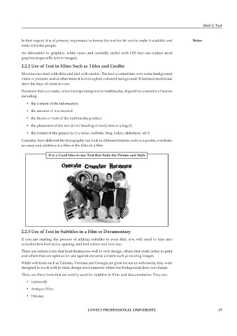
            Consider, how different the typography can look in different formats such as a poster, a website,
            an essay and subtitles in a film or the titles in a film.

                         it is a Good idea to use text that suits the picture and style


            2.2.3 Use of text in subtitles in a film or Documentary
            If you are starting the process of adding subtitles to your film, you will need to take into
            consideration font styles, spacing, and font colour and font size.
            There are certain fonts that lend themselves well to web design, others that work better in print
            and others that are optimal for use against dynamic content such as moving images.

            While web fonts such as Tahoma, Verdana and Georgia are great for use in web media, they were
            designed to work well in static design environments where the background does not change.
            There are three fonts that are widely used for subtitles in films and documentaries. They are:

               •  Univers45
               •  Antique Olive
               •  Tiresias.


                                             LoveLy professionaL University                                    17

