Page 174 - DCOM203_DMGT204_QUANTITATIVE_TECHNIQUES_I
P. 174
Unit 8: Correlation Analysis


                                                                                                Notes
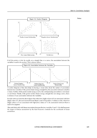
                                     Figure  8.1:  Scatter  Diagram


          If all the points or dots lie exactly on a straight line or a curve, the association between the
          variables is said to be perfect. This is shown below:
                              Figure  8.2: Association  between  the  Variables


          A scatter diagram of the data helps in having a visual idea about the  nature of association
          between two variables. If the points cluster along a straight line, the association between variables
          is linear. Further, if the points cluster along a curve, the corresponding association is non-linear
          or curvilinear. Finally, if the points neither cluster along a straight line nor along a curve, there
          is absence of any association between the variables.

          It is also obvious from the above figure that when low (high) values of X are associated with low
          (high) value of Y, the association between them is said to be positive. Contrary to this, when low
          (high) values of X are associated with high (low) values of  Y, the association between them is
          said to be negative.

          This unit deals only with linear association between the two variables X and Y. We shall measure
          the  degree of  linear association by the  Karl Pearson’s  formula for  the coefficient  of  linear
          correlation.


                                           LOVELY PROFESSIONAL UNIVERSITY                                   169

