Page 103 - DMGT552_VISUAL_MERCHANDISING
P. 103
Visual Merchandising


                    Notes          fairly universal. However, much of this information is culturally biased. We know that cultural
                                   traditions endow colours with powerful meanings that can differ greatly from place to place.
                                   For example, in Europe and the United States, black is the colour of mourning. In many tropical
                                   countries and in East Asia white is the colour of death. On the other hand, white is the colour
                                   worn by American brides, while brides in much of Asia wear red. Meanwhile, we know that the
                                   following associations are generally found to hold in Euro-American societies:
                                   Red: Associated with blood, and with feelings that are energetic, exciting, passionate or erotic.
                                   Most colours carry both  positive and negative  implications.  The  downside  of  red evokes
                                   aggressive feelings, suggesting anger or violence.

                                   Orange: The colour of flesh, or the friendly warmth of the hearth fire. The positive implications
                                   of this colour suggest approachability, informality. The negative side might imply accessibility
                                   to the points of suggesting that anyone can approach— a lack of discrimination or quality.
                                   Yellow: Is the colour of sunshine? This colour is optimistic, upbeat, and modern. The energy of
                                   yellow can become overwhelming. Therefore  yellow is not a colour that  tends to dominate
                                   fashion for long periods of time.
                                   Green: In its positive mode, green suggests nature (plant life, forests), life, stability, restfulness,
                                   and naturalness. On the other hand, green in some tones or certain contexts (such as green skin)
                                   might instead suggest decay (fungus, mould), toxicity, and artificiality.
                                   Blue: Suggests coolness, distance, spirituality, or perhaps reserved elegance. Some shade of blue
                                   is flattering to almost anyone. In its negative mode, we can think of the “blues”-the implication
                                   being one of sadness, passivity, alienation, or depression.

                                   Violet: Is the colour of fantasy, playfulness, impulsiveness, and dream states. In its negative
                                   mode, it can suggest nightmares, or madness.

                                   Pattern

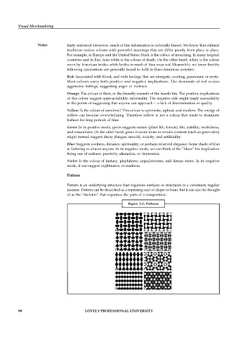
                                   Pattern is an underlying structure that organises surfaces or structures in a consistent, regular
                                   manner. Pattern can be described as a repeating unit of shape or form, but it can also be thought
                                   of as the “skeleton” that organises the parts of a composition.

                                                                 Figure  5.5:  Patterns


          98                                LOVELY PROFESSIONAL UNIVERSITY

