Page 107 - DMGT552_VISUAL_MERCHANDISING
P. 107
Visual Merchandising


                    Notes          Self Assessment

                                   State whether the following statements are true or false:
                                   16.  Colour-blocking also is an ineffective visual tool to separate and differentiate products
                                       that may be part of a larger comprehensive product category.

                                   17.  Colour blocking is most commonly styled with light colours.

                                   5.5 Signage

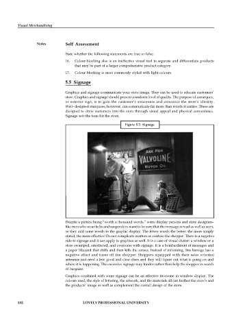
                                   Graphics and signage communicate your store image. They can be used to educate customers’
                                   store. Graphics and signage should present a uniform level of quality. The purpose of a marquee,
                                   or  exterior sign,  is to  gain  the  customer’s  awareness  and  announce  the  store’s  identity.
                                   Well- designed marquees, however, can communicate far more than words it carries. These are
                                   designed to draw customers into the store through  visual appeal and physical convenience.
                                   Signage sets the tone for the store.

                                                                 Figure 5.7:  Signage


                                   Despite a picture being “worth a thousand words,” some display persons and store designers-
                                   like men who wear belts and suspenders-want to be sure that the message is read as well as seen,
                                   so they add some words to the graphic display. The fewer words the better: the more simply
                                   stated, the more effective! Do not complicate matters or confuse the shopper. There is a negative
                                   side to signage and it can apply to graphics as well. It is a case of visual clutter: a window or a
                                   store swamped, smothered, and overcome with signage. It is a bombardment of messages and
                                   a paper blizzard that chills and then kills the senses. Instead of informing, this barrage has a
                                   negative effect  and  turns  off  the  shopper.  Shoppers  equipped  with  their sales  oriented
                                   antennae just need a few good and clear clues and they will figure out what is going on and
                                   where it is happening. The excessive signage may hinder rather than help the shopper in search
                                   of bargains.
                                   Graphics combined with some signage can be an effective twosome in window display. The
                                   colours used, the style of lettering, the artwork, and the materials all can further the store’s and
                                   the products’ image as well as complement the overall design of the store.


          102                               LOVELY PROFESSIONAL UNIVERSITY

