Page 112 - DMGT552_VISUAL_MERCHANDISING
P. 112
Unit 5: The Basics of Visual Merchandising


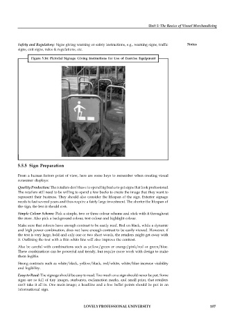
          Safety and Regulatory: Signs giving warning or safety instructions, e.g., warning signs, traffic  Notes
          signs, exit signs, rules & regulations, etc.

                 Figure 5.14:  Pictorial Signage  Giving  Instructions for  Use  of Exercise  Equipment


          5.5.5 Sign Preparation

          From a human factors point of view, here are some keys to remember when creating visual
          consumer displays:

          Quality Production: The retailers don’t have to spend big bucks to get signs that look professional.
          The retailers still need to be willing to spend a few bucks to create the image that they want to
          represent their business. They should also consider the lifespan of the sign. Exterior signage
          needs to last several years and thus require a fairly large investment. The shorter the lifespan of
          the sign, the less it should cost.
          Simple Colour Scheme: Pick a simple, two or three colour scheme and stick with it throughout
          the store. Also pick a background colour, text colour and highlight colour.

          Make sure that colours have enough contrast to be easily read. Red on black, while a dynamic
          and high power combination, does not have enough contrast to be easily viewed. However, if
          the text is very large, bold and only one or two short words, the retailers might get away with
          it. Outlining the text with a thin white line will also improve the contrast.

          Also be careful with combinations such as yellow/green or orange/pink/red or green/blue.
          These combinations can be powerful and trendy, but require more work with design to make
          them legible.

          Strong contrasts such as white/black, yellow/black, red/white, white/blue increase visibility
          and legibility.
          Easy to Read: The signage should be easy to read. Too much on a sign should never be put. Some
          signs are so full of tiny images, starbursts, exclamation marks, and small print, that retailers
          can’t take it all in. One main image; a headline and a few bullet points should be put in an
          informational sign.


                                           LOVELY PROFESSIONAL UNIVERSITY                                   107

