Page 114 - DMGT552_VISUAL_MERCHANDISING
P. 114
Unit 5: The Basics of Visual Merchandising


          4.   Blue: Blue’s coolness tends to connote dignity, serenity, wisdom and quite. While it use  Notes
               might not be appropriate for a business, which wishes to emphasise speed and efficiency,
               it might be used by a business which wants to suggest that it has a leisurely pace and a
               general atmosphere of cultivation and calm. It also tends to suggest stability and do banks
               and large corporations often use a colour.
          5.   Purple: Purple has come to be associated with royalty, pomp and luxuriousness. Its visibility
               factor is low, making it unsuitable for  freeway sign, but it  is often used for personal
               service business such as beauty salons.
          6.   Brown: Brown is the colour of the warmth and tends to connote naturalness and strength.
               Businesses, which want to indicate their strength and mainstream value system often, use
               brown and wood hues in their signs. Brown often connotes ranching and farming. Some
               fast-food franchises have used brown on their signs to suggest the ranch association of
               their foods. Brown is basically neutral due to its association with the earth and wood. It is
               not a colour to catch your eye or to suggest action.
          7.   White: White is Western society, has been the colour of innocence. On a sign it can be used
               to suggest cleanliness and purity.

          8.   Black: Black can be used effectively in signage to create an  impression of low-keyed
               crispness and sedateness. Sophistication also is suggested, if large areas are used.

          Self Assessment

          Fill in the blanks:
          18.  ............................. is an exciting, active colour.

          19.  Strong contrasts such as white/black, yellow/black, red/white, white/blue, etc. increase
               ............................. and .............................

          5.6 Understanding Materials


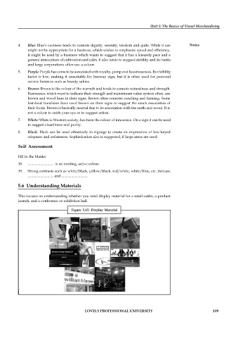
          This focuses on understanding whether you need display material for a retail outlet, a product
          launch, and a conference or exhibition hall.

                                     Figure  5.15:  Display  Material


                                           LOVELY PROFESSIONAL UNIVERSITY                                   109

