Page 213 - DMGT552_VISUAL_MERCHANDISING
P. 213
Visual Merchandising
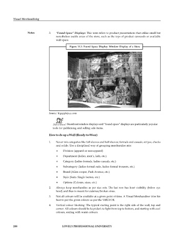
Notes 3. “Found-Space” Displays: This term refers to product presentations that utilise small but
nonetheless usable areas of the store, such as the tops of product carousels or available
wall space.
Figure 11.1: Found Space Display: Window Display of a Store
Source: bigapplejazz.com
Did u know? Storefront window displays and “found space” displays are particularly popular
tools for publicising and selling sale items.
How to do up a Wall (Ready-to-Wear)
1. Never mix categories like full sleeves and half sleeves; formals and casuals, stripes, checks
and solids. Use a disciplined way of grouping merchandise mix:
Division (apparel or non-apparel)
Department (ladies, men’s, kids, etc.)
Category (ladies formals, ladies casuals, etc.)
Subcategory (ladies formal suits, ladies formal trousers, etc.)
Brand (Allen cooper, Park Avenue, etc.)
Style (Suits: Single button, etc.)
Options (Colours, sizes, etc.)
2. Always keep merchandise as per size sets. The last row has least visibility (below eye
level) and thus is meant for cutsizes/broken sizes.
3. Not all colours will be available at a given point of time. A Visual Merchandiser tries his
best to put the given colours as per the VIBGYOR.
4. Vertical colour blocking: The typical starting point is the right side of the wall, top end
corner. All colours should be kept dark to light from top to bottom, and starting with cool
colours, ending with warm colours.
208 LOVELY PROFESSIONAL UNIVERSITY

