Page 226 - DMGT552_VISUAL_MERCHANDISING
P. 226
Unit 11: Window Displays
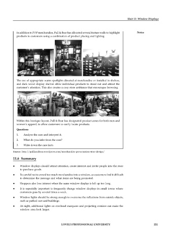
In addition to POP merchandise, Pull & Bear has allocated several feature walls to highlight Notes
products to customers using a combination of product placing and lighting.
The use of appropriate warm spotlights directed at merchandise or installed in shelves,
and dark wood display shelves allow individual products to stand out and attract the
customer’s attention. This also creates a cosy store ambiance that encourages browsing.
Within this boutique layout, Pull & Bear has designated product zones for both men and
women’s apparel, to allow customers to easily locate products.
Questions
1. Analyse the case and interpret it.
2. What do you infer from the case?
3. Write down the case facts.
Source: http://pulllandbear.wordpress.com/merchandise-presentation-store-design/
11.6 Summary
Window displays should attract attention, create interest and invite people into the store
to purchase goods.
Be careful not to crowd too much merchandise into a window, as customers find it difficult
to determine the message and what items are being promoted.
Shoppers also lose interest when the same window display is left up too long.
It is especially important to frequently change window displays in small towns where
customers pass by several times a week.
Window lights should be strong enough to overcome the reflections from outside objects,
such as parked cars and buildings.
At night, additional lights on overhead marquees and projecting cornices can make the
window area look larger.
LOVELY PROFESSIONAL UNIVERSITY 221

