
Page 92 - DLIS402_INFORMATION_ANALYSIS_AND_REPACKAGING
P. 92
Unit 3: Information Products
Other degrees of lightness: Shapes are airier, lifting off the page. Designs are rising out of their 2D Notes
resting places and suggesting that they would really like to go places. In some logos, line weights
are slimmer. There’s plenty of transparency, too, as if light is now able to flow right through.
It feels like what people believe a logo to be is also becoming more transcendent. A logo is no longer
a single piece of flat art. It can be a favicon, an icon, or an entire set of marks that work together to
support the team. Its boundaries have become less strict as well. There was a time when most logos
could be enclosed in a simple hand-drawn square, circle or similar geometric shape, but now many
logos drag outside those outlines. They just don’t want to fit the old mold.
We also saw plenty of:
Items related to wine—bottles, corks, glasses, corkscrews.
Sticking with the light theme, lots of sunrises—or are they sunsets?
For some curious reason, mortar and pestles, owls, and zebras (not in the same designs).
Single-, double- or triple-line ribbons—almost like Chartpak tape of the 1970s—that run through
letters and designs.
What stood out most of all were trees (which incidentally are the most searched-for word on the
LogoLounge site). There was also a hyper-resurgence of leaves, but leaves being used in really
creative way: floating on water to represent stepping stones, celtic knots built out of leaves, a sculling
team rowing a leaf-boat, the veins of which represent oars. Trees and leaves are not just used to
represent sustainability/nature anymore, but the designs in which they are used do get the added
perk of being basking in a pleasing ecological light.
The 2011 Trend Report
Every year, it’s worth noting that this is a report on trends, not a recipe book of styles. It is also not a
finite list: There are other valid trends out there that are not mentioned here.
The report should serve you as an ongoing view of where logo design is headed. The word “trends”
in itself can have a very negative cast, but in truth, trends aren’t bad. They reveal our growth. It’s
our take on them that allows us to move even further forward.
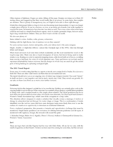
Gradients
Not every trick in the designer’s palette has to be over the top: Subtlety can certainly play a role in the
ongoing battle to capture the eye of the consumer. In a number of logo designs, a gentle linear gradation
is taking hold—just a modest tweak to a flat, single colour solution. The colour gradation may be no
more than a ten percent shift of colour value, or it may be more dramatic, like Chermayeff and Geismar’s
Women’s Tennis Association logo, which veers from a magenta to a deep violet.
This direction allows designers to create a solution that visually coveys a message of motion or
change in colouration but not through the vector shape or image. This is a continuation of trends
identified over the last two years that have seen designers being more likely than ever to use the
surface of a mark as an opportunity to introduce an additional statement.
From a technical perspective, this presents a formula and reproduction challenge that must be
monitored. Simple linear gradations are notorious for shifting between platforms and file types. If
monitored with vigilance, though, the rewards will exceed the grief.
1. Rylander Design, Baker Ave 2. Signifly, Plesso 3. Pixonal, Stallion 4. Chermayeff & Geismar Inc.,
Women’s Tennis Association
Juvi
These are logos that look like Napster had his way with Hello Kitty: All are far too cute, with the
smell of cigarettes on their breath. I believe we have seen this coming for some time, but this last year
LOVELY PROFESSIONAL UNIVERSITY 87