Page 63 - DCOM203_DMGT204_QUANTITATIVE_TECHNIQUES_I
P. 63
Quantitative Techniques – I


                    Notes          12.  Frequency Polygon
                                   13.  Frequency Curve
                                   14.  'Ogive' or Cumulative Frequency Curve
                                   1.  Line Diagram: In case of a line diagram, different values are represented by the length of
                                       the lines, drawn vertically or horizontally. The gap between the successive lines is kept
                                       uniform. The comparison of values of various items is done by the length of these lines.
                                       Although the comparison is easy, the diagram is not very attractive. This diagram is used
                                       when the number of items is relatively large.


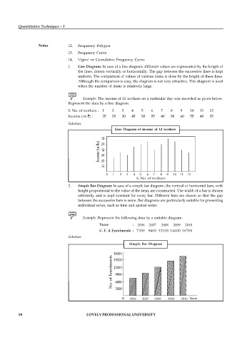
                                          Example: The income of 12 workers on a particular day was recorded as given below.
                                   Represent the data by a line diagram.

                                   S. No. of workers :  1  2  3   4    5   6    7    8    9    10  11   12
                                   Income ( in  ) :  25  35  30   45   50  55   40   50   60   55  40   35

                                   Solution.
                                                          Line Diagram of income of 12 workers


                                   2.  Simple Bar Diagram: In case of a simple bar diagram, the vertical or horizontal bars, with
                                       height proportional to the value of the item, are constructed. The width of a bar is chosen
                                       arbitrarily and is kept constant for every bar. Different bars are drawn so that the gap
                                       between the successive bars is same. Bar diagrams are particularly suitable for presenting
                                       individual series, such as time and spatial series.

                                          Example: Represent the following data by a suitable diagram.

                                                  Years                          :  2006    2007     2008       009       010
                                                                                      2
                                                                                            2
                                                    C. F. A Enrolments  : 7300 9400 12100 14600 16700
                                   Solution:
                                                                 Simple Bar  Diagram


                                                                 2006       2007       2008        2009        2010


          58                                LOVELY PROFESSIONAL UNIVERSITY

