Page 119 - SOFTWARE TESTING & QUALITY ASSURANCE
P. 119
Software Testing and Quality Assurance


                          5.   Colors/Backgrounds: When the sites have colors/backgrounds for pictures or texts, ensure that the
                              user does not find it difficult to read the content. It would therefore be better to use little or no
                              background. However, when a background is required, avoid using bright colors because patterns
                              and pictures divert the user’s attention from the content on the Web site.

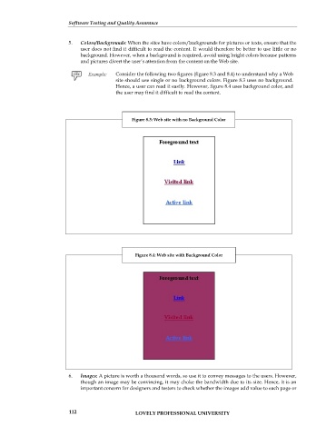
                                           Consider the following two figures (figure 8.3 and 8.4) to understand why a Web
                                           site should use single or no background colors. Figure 8.3 uses no background.
                                           Hence, a user can read it easily. However, figure 8.4 uses background color, and
                                           the user may find it difficult to read the content.


                                                 Figure 8.3: Web site with no Background Color


                                                  Figure 8.4: Web site with Background Color


                          6.   Images: A picture is worth a thousand words, so use it to convey messages to the users. However,
                              though an image may be convincing, it may choke the bandwidth due to its size. Hence, it is an
                              important concern for designers and testers to check whether the images add value to each page or


                          112                     LOVELY PROFESSIONAL UNIVERSITY

