Page 75 - DMGT206_PRODUCTION_AND_OPERATIONS_MANAGEMENT
P. 75
Production and Operations Management


                    Notes          The range was calculated by visually examining the observation data in each row and subtracting
                                   the largest number from the smallest number. The range is a measure of dispersion, i.e. it is the
                                   difference between the maximum and minimum values in a sample.
                                   The mean of the means was found by selecting the S symbol and averaging the values of ‘µ’. This
                                   time we are averaging a column and must ensure that the correct column is selected. The mean
                                   of the ranges are also calculated in a similar manner by selecting the S symbol and averaging the
                                   values of ‘R’. The mean values are shown in row 15 in the table.
                                   Standard tables are available that give  the number of defective pieces acceptable in each lot
                                   based on the size of the sample. Using such a table, with n = 3, we get; d2 = 1.693. The standard
                                   deviation of the sample can be calculated by dividing the value of the mean of the range (µ) by
                                   the value d2.
                                   The standard error of the sample is obtained using the formula given below and is shown in row
                                   18 of the figure.
                                                                    sµ = s / v n
                                   Though the Upper Control Limit (UCL) and the Lower Control Limit (LCL), by convention and
                                   due to standard statistical practice, it is normally fixed at 3 times the standard deviation. Based
                                   on this rationale, the UCL and LCL have been shown in rows 20 and 21 in the figure.

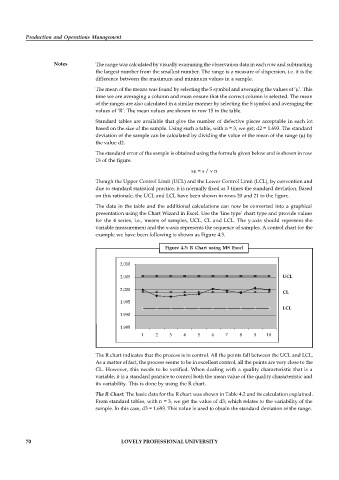
                                   The data in the table and the additional calculations can now be converted into a  graphical
                                   presentation using the Chart Wizard in Excel. Use the ‘line type’ chart type and provide values
                                   for the 4 series, i.e., means of samples, UCL, CL and LCL. The y-axis should represent  the
                                   variable measurement and the x-axis represents the sequence of samples. A control chart for the
                                   example we have been following is shown as Figure 4.3.

                                                           Figure 4.3:  R Chart  using MS  Excel


                                           2.010

                                           2.005                                                    UCL


                                           2.000
                                                                                                    CL

                                           1.995
                                                                                                    LCL
                                           1.990
                                           1.985
                                                   1    2    3    4    5   6    7    8    9    10

                                   The R chart indicates that the process is in control. All the points fall between the UCL and LCL.
                                   As a matter of fact, the process seems to be in excellent control, all the points are very close to the
                                   CL. However, this needs to be verified.  When dealing with a quality characteristic that is a
                                   variable, it is a standard practice to control both the mean value of the quality characteristic and
                                   its variability. This is done by using the R chart.
                                   The R Chart: The basic data for the R chart was shown in Table 4.2 and its calculation explained.
                                   From standard tables, with n = 3, we get the value of d3; which relates to the variability of the
                                   sample. In this case, d3 = 1.693. This value is used to obtain the standard deviation of the range.


          70                                LOVELY PROFESSIONAL UNIVERSITY

