Page 150 - DMGT507_SALES AND PROMOTIONS MANAGEMENT
P. 150
Sales and Promotions Management


                    Notes
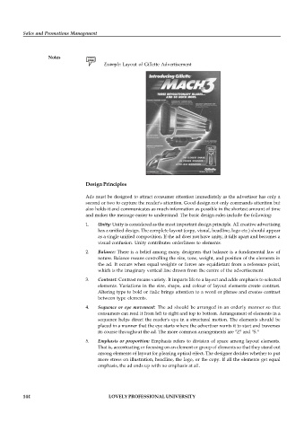
                                          Example: Layout of Gillette Advertisement


                                   Design Principles


                                   Ads must be designed to attract consumer attention immediately as the advertiser has only a
                                   second or two to capture the reader's attention. Good design not only commands attention but
                                   also holds it and communicates as much information as possible in the shortest amount of time
                                   and makes the message easier to understand. The basic design rules include the following:
                                   1.  Unity: Unity is considered as the most important design principle. All creative advertising
                                       has a unified design. The complete layout (copy, visual, headline, logo etc.) should appear
                                       as a single unified composition. If the ad does not have unity, it falls apart and becomes a
                                       visual confusion. Unity contributes orderliness to elements.
                                   2.  Balance: There is a belief among many designers that balance is a fundamental law of
                                       nature. Balance means controlling the size, tone, weight, and position of the elements in
                                       the ad.  It occurs when equal weights or forces are equidistant from a reference point,
                                       which is the imaginary vertical line drawn from the centre of the advertisement.
                                   3.  Contrast: Contrast means variety. It imparts life to a layout and adds emphasis to selected
                                       elements. Variations in the  size, shape, and colour of layout  elements create contrast.
                                       Altering type to bold or italic brings attention to a word or phrase and creates contrast
                                       between type elements.
                                   4.  Sequence or  eye movement:  The ad should  be arranged in an  orderly manner so  that
                                       consumers can read it from left to right and top to bottom. Arrangement of elements in a
                                       sequence helps direct the reader's eye in a structural motion. The  elements should be
                                       placed in a manner that the eye starts where the advertiser wants it to start and traverses
                                       its course throughout the ad. The more common arrangements are "Z" and "S."

                                   5.  Emphasis or proportion: Emphasis refers to division of space among layout elements.
                                       That is, accentuating or focusing on an element or group of elements so that they stand out
                                       among elements of layout for pleasing optical effect. The designer decides whether to put
                                       more stress on illustration, headline, the logo, or the copy. If all the elements get equal
                                       emphasis, the ad ends up with no emphasis at all.


          144                               LOVELY PROFESSIONAL UNIVERSITY

