Page 137 - DLIS401_METHODOLOGY_OF_RESEARCH_AND_STATISTICAL_TECHNIQUES
P. 137
Methodology of Research and Statistical Techniques


                 Notes
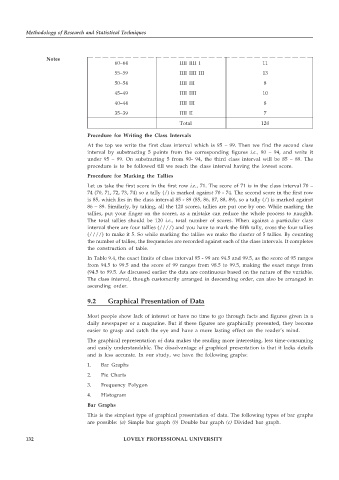
                                         60–64                  IIII  IIII I                 11
                                         55–59                  IIII  IIII III               13

                                         50–54                  IIII  III                     8
                                         45–49                  IIII  IIII                   10
                                         40–44                  IIII  III                     8
                                         35–39                  IIII  II                      7
                                                                Total                        120

                                Procedure for Writing the Class Intervals
                                At the top we write the first class interval which is 95 – 99. Then we find the second class
                                interval by substracting 5 points from the corresponding figures  i.e., 90 – 94, and write it
                                under 95 – 99. On substracting 5 from 90- 94, the third class interval will be 85 – 89. The
                                procedure is to be followed till we reach the class interval having the lowest score.
                                Procedure for Marking the Tallies
                                Let us take the first score in the first row  i.e., 71. The score of 71 is in the class interval 70 –
                                74 (70, 71, 72, 73, 74) so a tally (/) is marked against 70 - 74. The second score in the first row
                                is 85, which lies in the class interval 85 - 89 (85, 86, 87, 88, 89), so a tally (/) is marked against
                                86 – 89. Similarly, by taking, all the 120 scores, tallies are put one by one. While marking the
                                tallies, put your finger on the scores, as a mistake can reduce the whole process to naughlt.
                                The total tallies should be 120  i.e., total number of scores. When against a particular class
                                interval there are four tallies (////) and you have to mark the fifth tally, cross the four tallies
                                (////) to make it 5. So while marking the tallies we make the cluster of 5 tallies. By counting
                                the number of tallies, the frequencies are recorded against each of the class intervals. It completes
                                the construction of table.
                                In Table 9.4, the exact limits of class interval 95 - 99 are 94.5 and 99.5, as the score of 95 ranges
                                from 94.5 to 99.5 and the score of 99 ranges from 98.5 to 99.5, making the exact range from
                                (94.5 to 99.5. As discussed earlier the data are continuous based on the nature of the variable.
                                The class interval, though customarily arranged in descending order, can also be arranged in
                                ascending order.

                                9.2    Graphical Presentation of Data


                                Most people show lack of interest or have no time to go through facts and figures given in a
                                daily newspaper or a magazine. But if these figures are graphically presented, they become
                                easier to grasp and catch the eye and have a more lasting effect on the reader’s mind.
                                The graphical representation of data makes the reading more interesting, less time-consuming
                                and easily understandable. The disadvantage of graphical presentation is that it lacks details
                                and is less accurate. In our study, we have the following graphs:
                                1.  Bar Graphs

                                2.  Pie Charts
                                3.  Frequency Polygon
                                4.  Histogram
                                Bar Graphs
                                This is the simplest type of graphical presentation of data. The following types of bar graphs
                                are possible:  (a)  Simple bar graph  (b)  Double bar graph  (c) Divided bar graph.


          132                               LOVELY PROFESSIONAL UNIVERSITY

