Page 140 - DLIS401_METHODOLOGY_OF_RESEARCH_AND_STATISTICAL_TECHNIQUES
P. 140
Unit 9: Presentation of Data


          If we observe Figures 9.1 and 9.2, we find that figure 9.2 is simpler than Fig. 9.1. Figure 9.1  Notes
          is complex because the number of class intervals is more. If we further increase the number
          of class intervals, the figure obtained will be still more complex. So for plotting the histogram
          for a given data, usually we prefer to have less number of class intervals.


          9.3.2  Bar Diagram or Bar Graph

          If the variable is discrete, then a histogram cannot be constructed as the classes are not comparable
          in terms of magnitude. However, a simple graphical presentation, quite similar to histogram,
          known as bar graph, may be constructed. In a particular town, total number of schools is 24
          and the management-wise distribution of schools is as shown earlier in Table 9.2.
                           Management                        No. of Schools

                           Govenment                               4
                           Local Body                              8
                           Private Aided                           10
                           Private Unaided                         2

                           Total                                   24
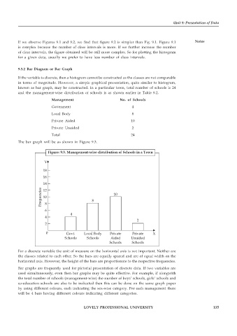
          The bar graph will be as shown in Figure 9.3.


                         Figure: 9.3. Management-wise distribution of Schools in a Town
                       Y

                       18
                       16
                       14
                      Frequencies  12          8          10
                       10
                        8
                        6
                                    4
                        4
                                                                      2
                        2
                        0         Govt.    Local Body   Private    Private    X
                                  Schools    Schools     Aided     Unaided
                                                        Schools    Schools
          For a discrete variable the unit of measure on the horizontal axis is not important. Neither are
          the classes related to each other. So the bars are equally spaced and are of equal width on the
          horizontal axis. However, the height of the bars are proportionate to the respective frequencies.
          Bar graphs are frequently used for pictorial presentation of discrete data. If two variables are
          used simultaneously, even then bar graphs may be quite effective. For example, if alongwith
          the total number of schools (management-wise) the number of boys’ schools, girls’ schools and
          co-education schools are also to be indicated then this can be done on the same graph paper
          by using different colours, each indicating the sex-wise category. For each management there
          will be 4 bars having different colours indicating different categories.


                                           LOVELY PROFESSIONAL UNIVERSITY                                   135

