Page 185 - DCOM504_SECURITY_ANALYSIS_AND_PORTFOLIO_MANAGEMENT
P. 185
Security Analysis and Portfolio Management


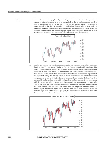
                    Notes              investor is to draw on graph on logarithmic paper a series  of vertical lines, each line
                                       representing the price movements for a time period – a day, a week, or even a year The
                                       vertical dimensions of the line  represent price; the horizontal  dimension indicates the
                                       time involved by the chart as a whole.  In a daily chart, for example, each vertical line
                                       represents the range of each day's  price activity, and the chart as a whole may extend for
                                       a month. For this, extend the line on the graph paper  from the highest transaction of each
                                       day drawn to the lowest and make a cross mark to indicate the closing price.
                                                               Figure  6.4:  A Bar  Chart


                                   3.  Candlestick Charts:  The Candlestick chart is similar to a bar chart, but it differs in the way
                                       that it is visually constructed.  Similar to  the bar chart, the candlestick also has a thin
                                       vertical line showing the period's trading range. The difference comes in the formation of
                                       a wide bar on the vertical line, which illustrates the difference between the open and close.
                                       And, like bar charts, candlesticks also rely heavily on the use of colours to explain what
                                       has happened during the trading period. A major problem with the candlestick colour
                                       configuration,  however, is that different  sites use different standards; therefore, it is
                                       important to understand the candlestick configuration used at the chart site you are working
                                       with. There are two colour constructs for days up and one for days that the price falls.
                                       When the price of the stock is up and closes above the opening trade, the candlestick will
                                       usually be white or clear. If the stock has traded down for the period, then the candlestick
                                       will usually be red or black, depending on the site. If the stock's price has closed above the
                                       previous day's close but below the day's open, the candlestick will be black or filled with
                                       the colour that is used to indicate an up day.

                                                            Figure 6.5:  A  Candlestick  Chart


          180                               LOVELY PROFESSIONAL UNIVERSITY

