Page 192 - DCOM504_SECURITY_ANALYSIS_AND_PORTFOLIO_MANAGEMENT
P. 192
Unit 6: Technical Analysis


                    For instance, in a five-day linear weighted average, today's closing price is multiplied  Notes
                    by five, yesterday's by  four and so on,  until the first day  in the period range  is
                    reached. These numbers are then added together and divided by the sum of the
                    multipliers.
               (b)  Moving Average Convergence Divergence (MACD): The moving average convergence
                    divergence (MACD) is one of the most well-known and used indicators in technical
                    analysis. This indicator is comprised of two exponential moving averages, which
                    help to measure momentum in the security. The MACD is  simply the difference
                    between these two moving averages plotted against a centreline. The centreline is
                    the point at which the two moving averages are equal. Along with the MACD and
                    the centreline, an exponential moving average of the MACD itself is plotted on the
                    chart. The idea behind this momentum indicator is to measure short-term momentum
                    compared to the longer term momentum to help  signal the  current direction of
                    momentum.
                    MACD = shorter-term moving average – longer-term moving average
               When the MACD is positive, it signals that the shorter-term moving average is above the
               longer-term moving average and suggests upward momentum. The opposite holds true
               when the MACD is negative – this signals that the shorter-term is below the longer and
               suggest downward momentum. When the MACD line crosses over the centreline, it signals
               a crossing in the moving averages. The most common moving average values used in the
               calculation are the 26-day  and 12-day exponential moving averages. The  signal line  is
               commonly created by using a nine-day exponential moving average of the MACD values.
               These values can be adjusted to meet the needs of the technician and the security. For more
               volatile securities, shorter-term averages are used, while less volatile securities  should
               have longer averages.
               Another aspect to the MACD indicator that is often found on charts is the MACD histogram.
               The histogram is plotted on the centreline and represented by bars. Each bar is the difference
               between the MACD and the signal line or, in most cases, the nine-day exponential moving
               average. The higher the bars  are in either direction,  the more momentum behind the
               direction in which the bars point.
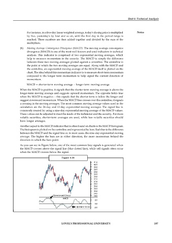
               As you can see in Figure below, one of the most common buy signals is generated when
               the MACD crosses above the signal line (blue dotted line), while sell signals often occur
               when the MACD crosses below the signal.

                                            Figure  6.16


                                            LOVELY PROFESSIONAL UNIVERSITY                                  187

